
Whole Home Benjamin Moore Paint Color Scheme
Are you wondering how to pull together paint colors to create a whole home palette that flows beautifully from room to room? Today I’m sharing our whole home Benjamin Moore paint color scheme from our renovated forest house.
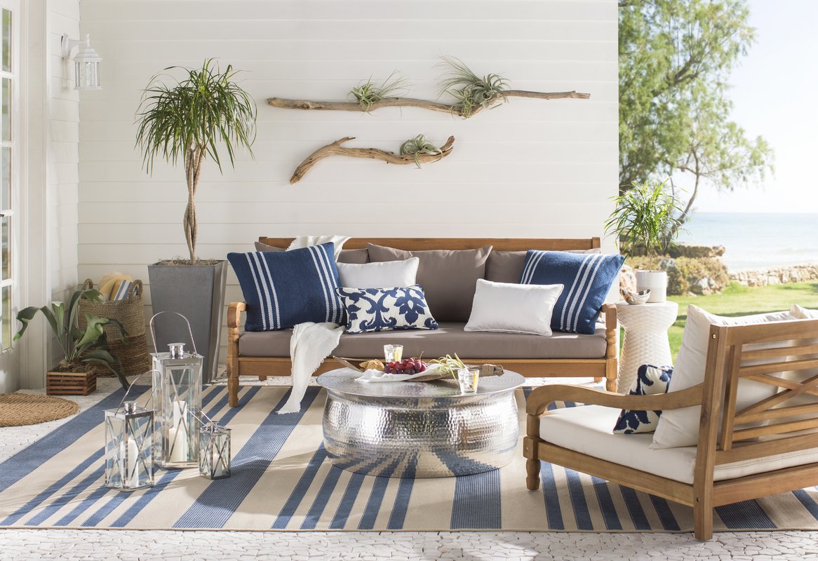
On the heels of my last post, our full home renovation reveal of our forest house, I’ve had several readers email me or send me messages or post comments asking about the paint colors that we used in that home. While we mainly used white throughout the house, we also used some grey and blue accents in most rooms as well.
White paint colours can be calming and restful, but painting your entire house white is, in and of itself, quite a strong and impactful choice. I personally find white to be a perfect backdrop to using other tones and hues in my decor choices. I love decorating with colour, and find that a white shell allows me to integrate a variety of colours that I can switch around seasonally. The white walls keep things tranquil and sophisticated without being boring. The pops of colour sprinkled throughout the house add interest and dimension.
Colour Scheme
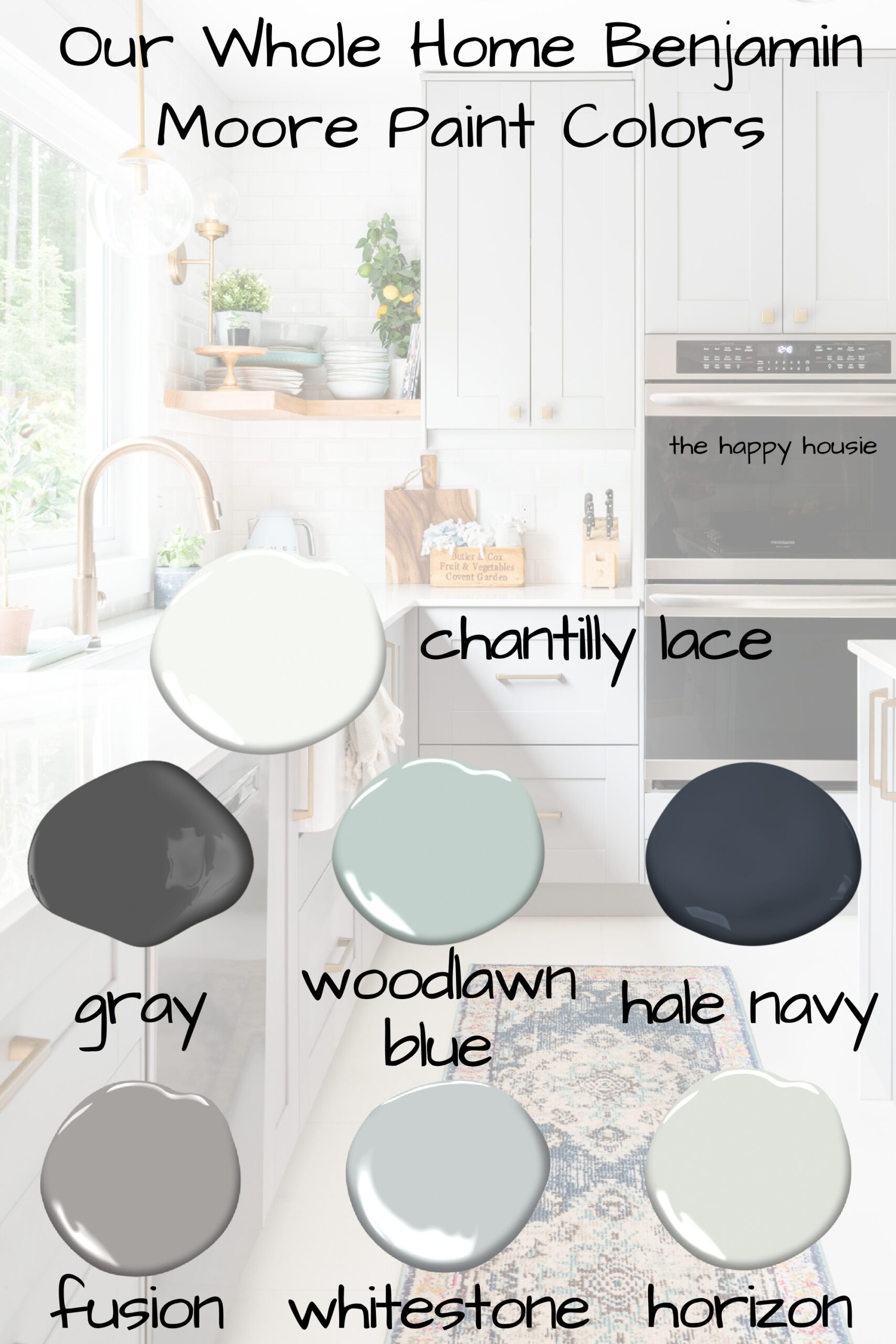
I put together most of this whole home paint colour scheme before we moved in and began any of the painting and kept my paint chips taped to a piece of paper and tucked away safely in my office cupboard for easy access whenever I needed to refer to them as we worked our way through the house. Picking my colours ahead of time like that allowed me to create a cohesive feeling and a good sense of flow from room to room. I used a variety of paint brands in this house but have colour matched all of my colours (including the kitchen cabinets, which came grey), to Benjamin Moore colours as most people have access to Benjamin Moore paints or a store that colour matches to Benjamin Moore.

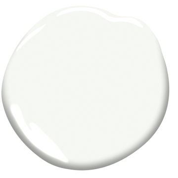
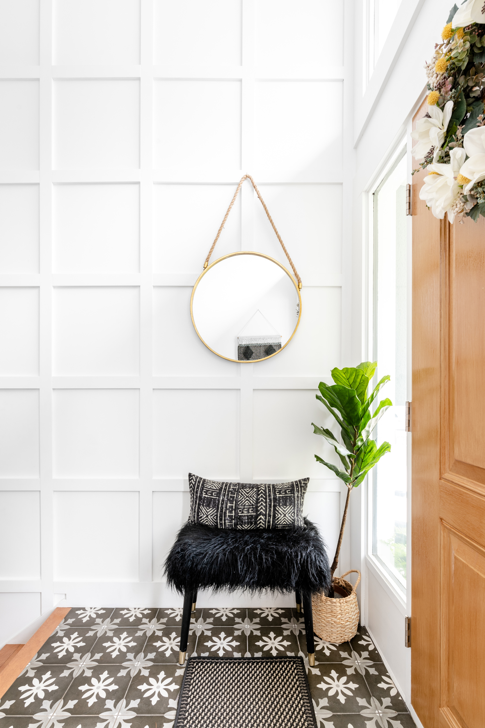
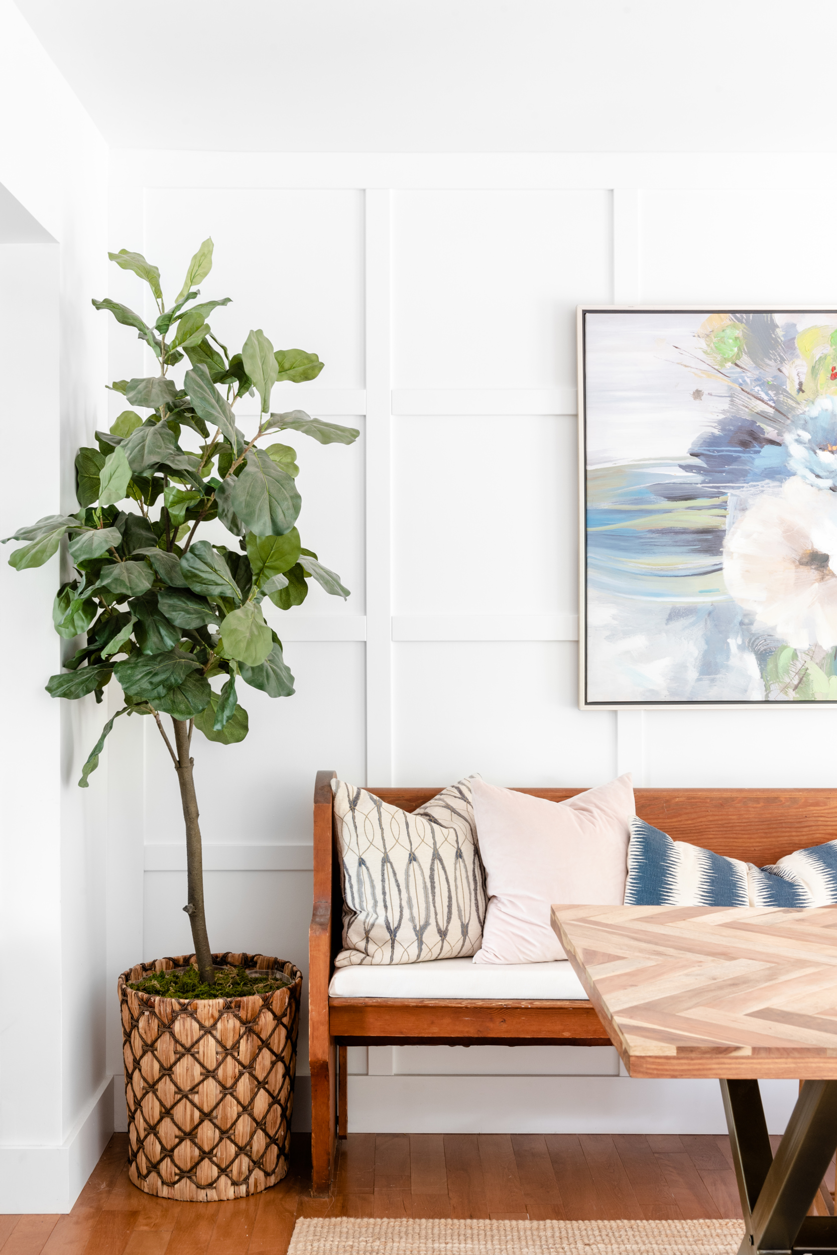
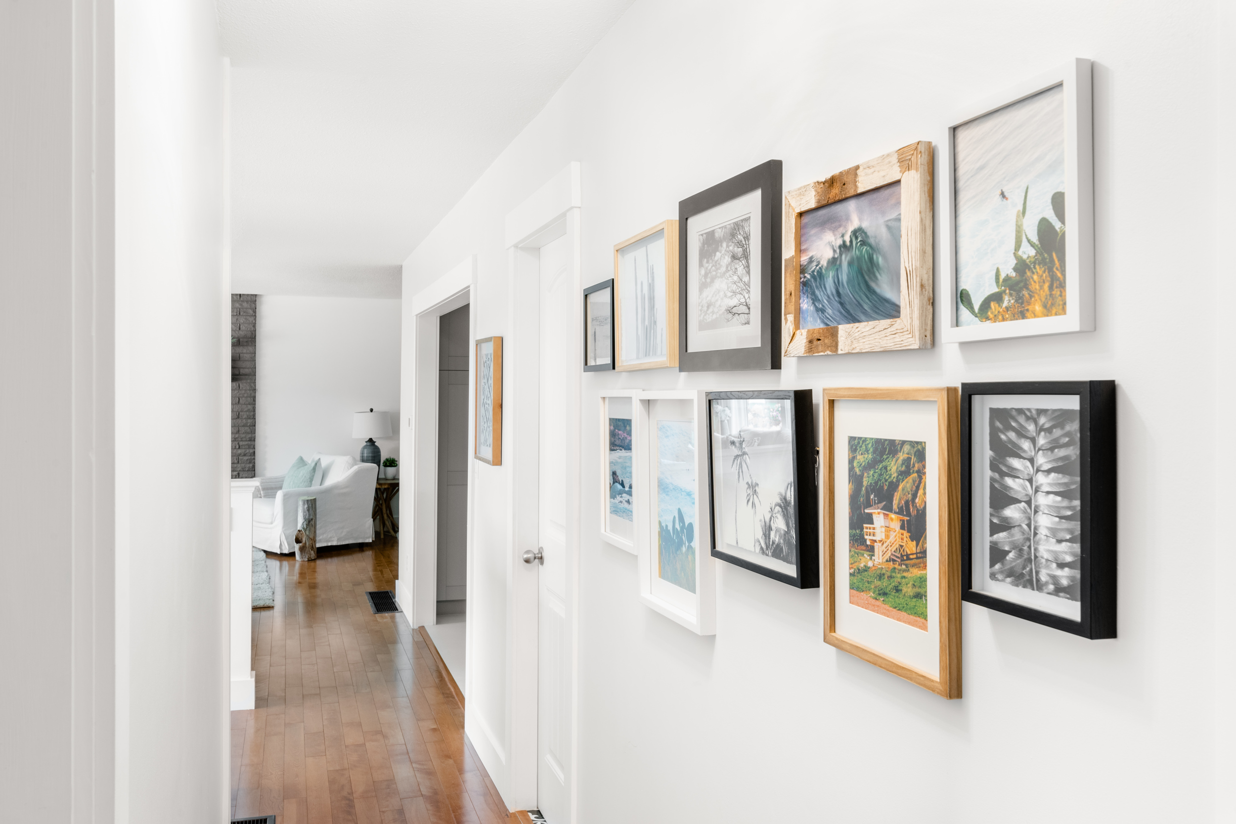
As I mentioned, we painted the majority of the walls and all of the trim in our house a soft white which I colour matched most closely to Benjamin Moore Chantilly Lace. This is a beautiful, very popular, fresh and crisp white by Benjamin Moore that is not too blue in tone so it’s still warm and welcoming. I especially love the look of fresh, crisp white on paneling and woodwork, how about you? It creates such a strong impact and the trim work adds great dimension without being overpowering. We’re going to use this paint colour throughout our new build house as well.
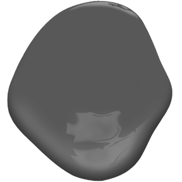
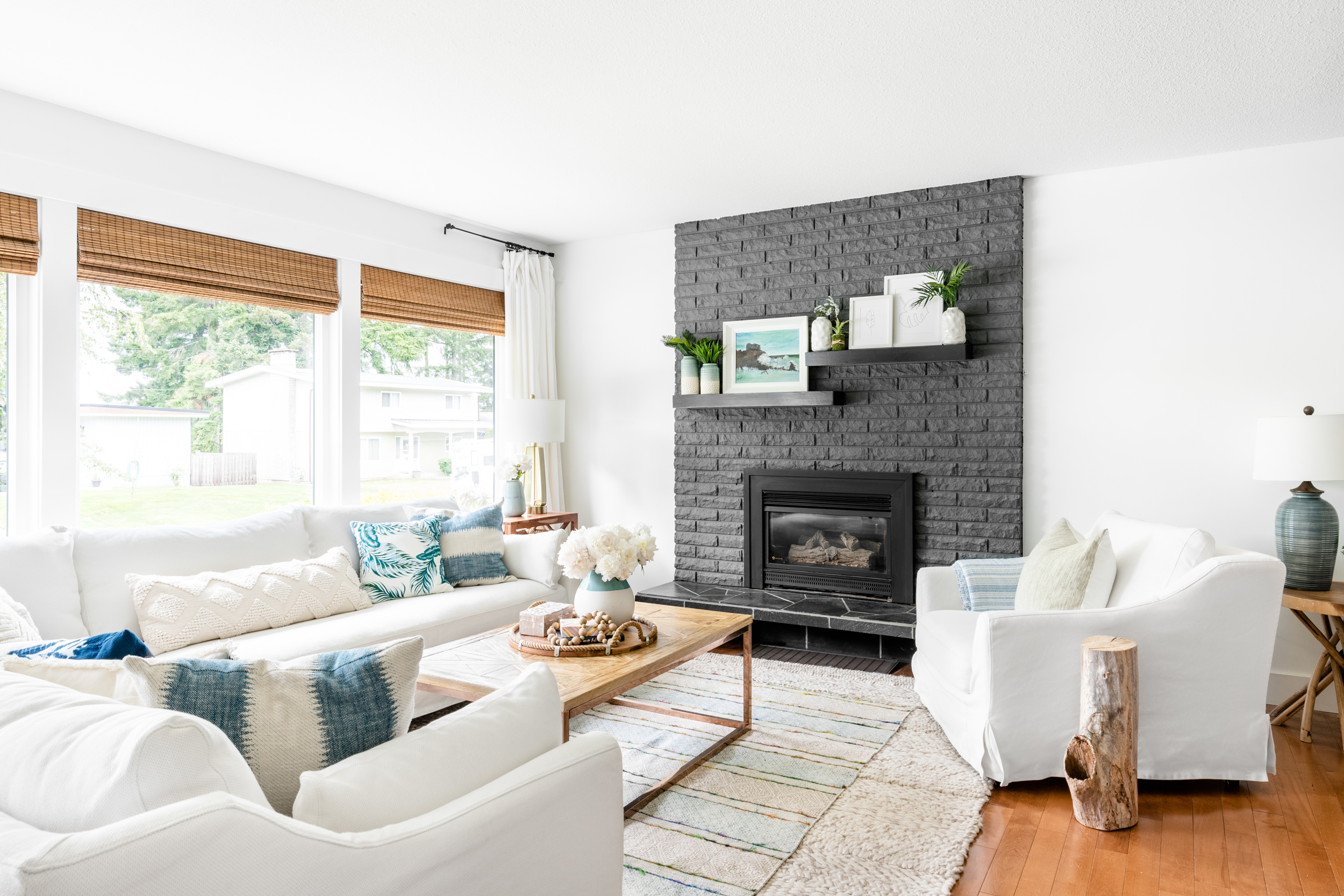
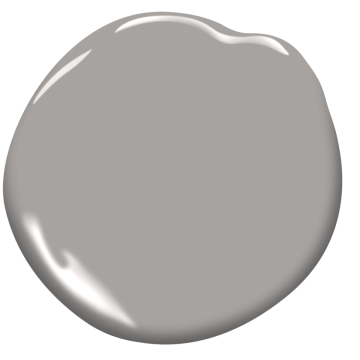
We added a pop of charcoal grey on our fireplace in the living room, as well as on an accent wall in the adjoining TV area. I think the colour really accentuated the fireplace and added a touch of elegance and sophistication to what could have been a dated looking focal point in our room. The closest Benjamin Moore grey to the charcoal hue that I chose is called, simply, “Gray”.
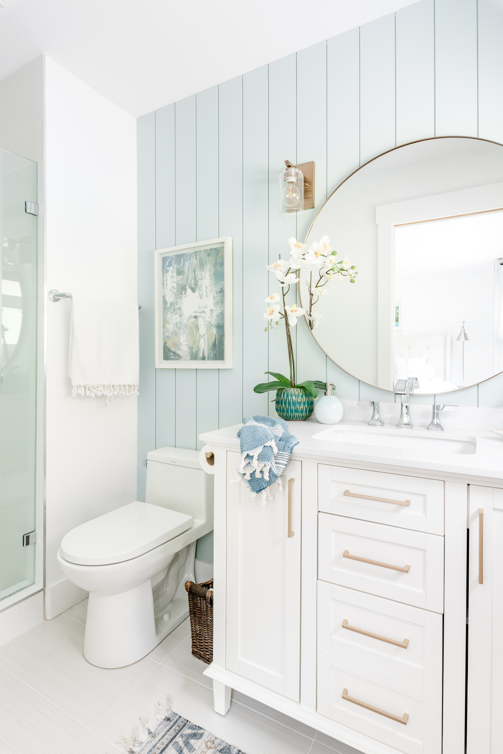
One of the questions I get asked most frequently is what is the paint colour in our master bedroom ensuite? The walls were all white aside from the accent colour that we added to the vertical shiplap installed behind the vanity and toilet. I chose a tranquil and misty tone that I colour matched to Benjamin Moore’s Woodlawn Blue. I love the way this colour worked with our warm white vanity and gold hardware and mirror.
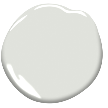
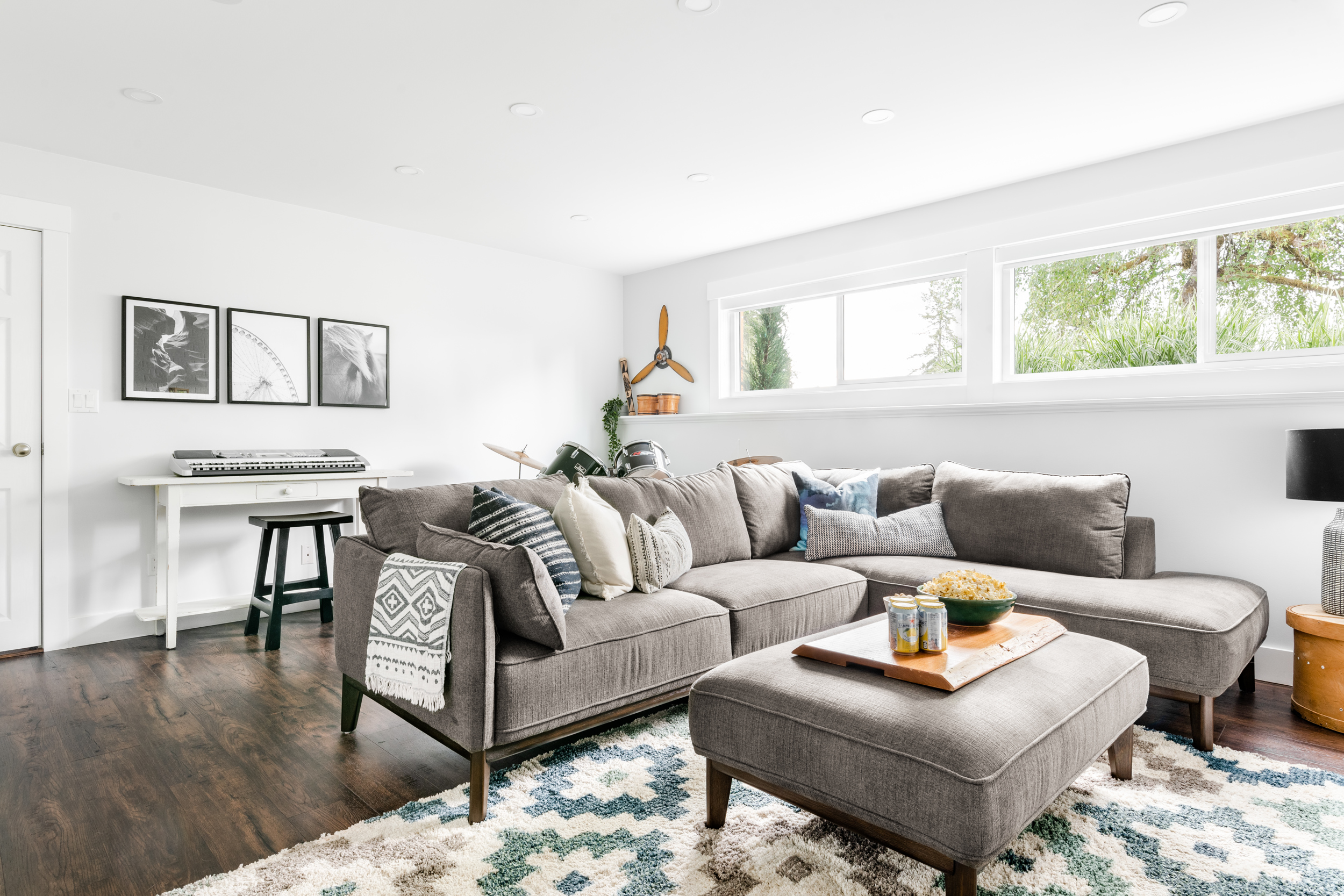
In the upstairs hallway as well as in the basement family room we painted a very light, airy, fresh but slightly warm grey tone matched to Benjamin Moore Horizon. It almost looks white in the photographs, because it’s so fresh and bright, but you can just see the contrast between the walls and the Chantilly Lace trim. This light warm grey kept things feeling elegant and tranquil while adding some dimension in these spaces that might have felt a bit cold had they been painted all pure white.
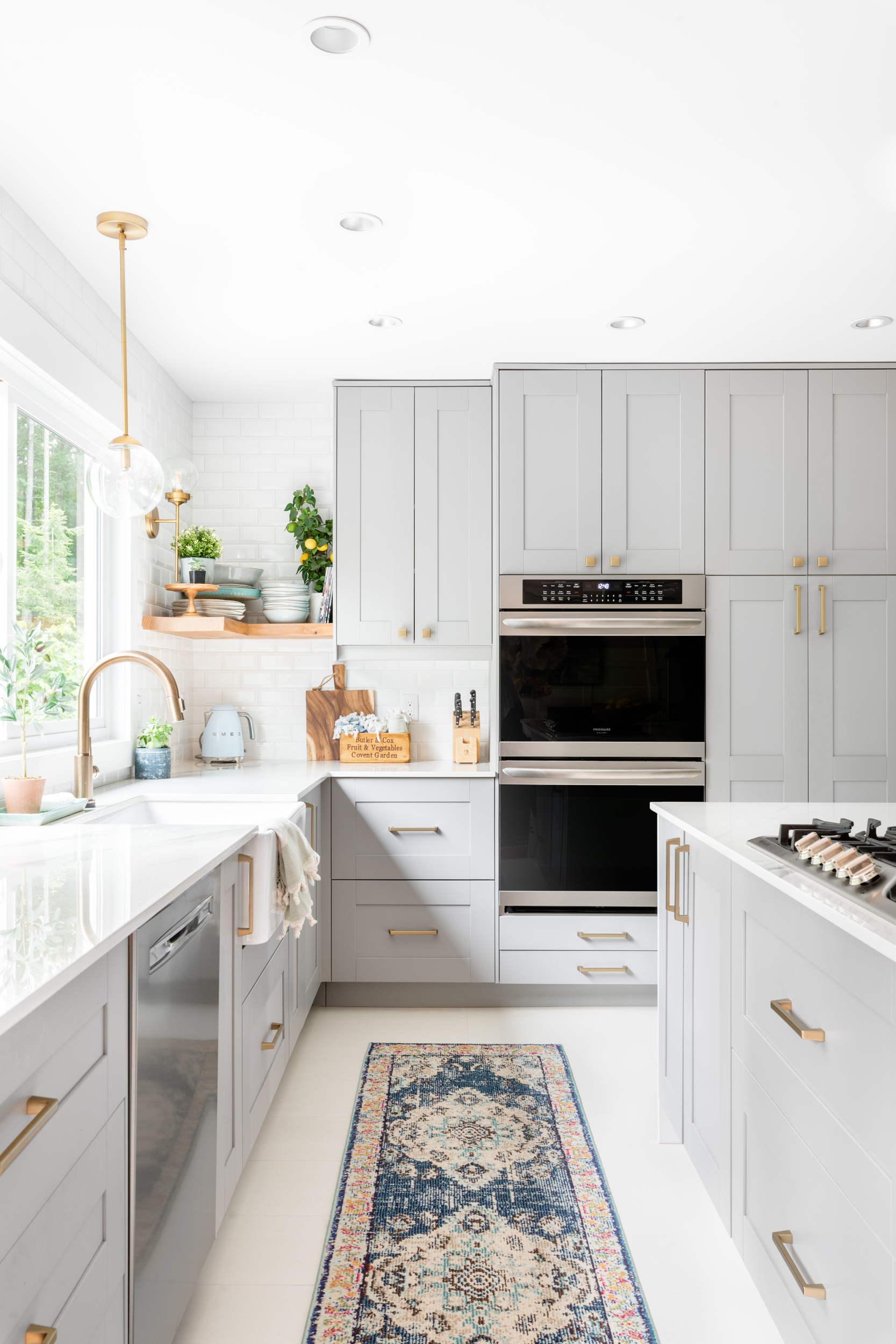
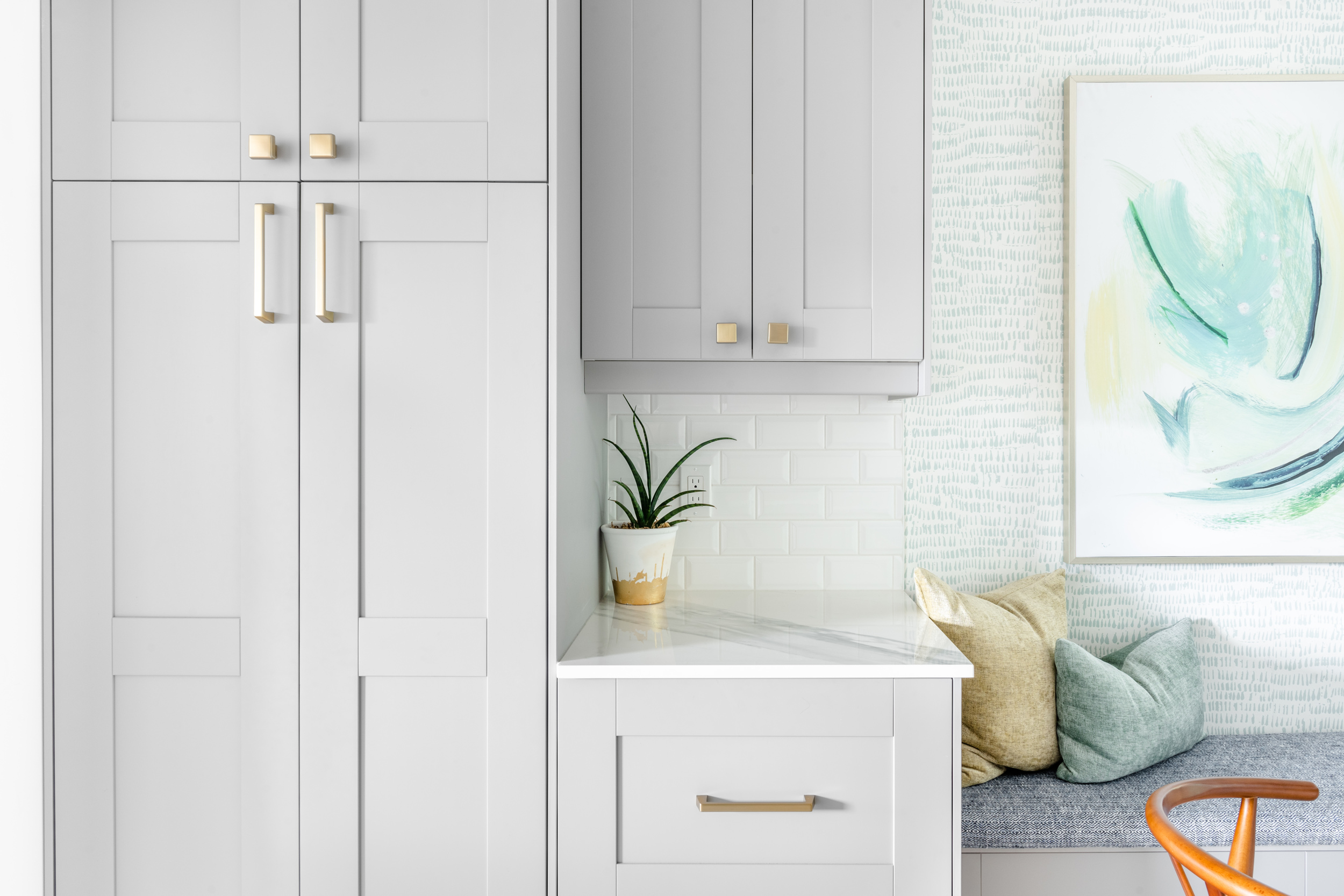
I also get quite a few reader emails asking about our kitchen cabinet colour. It’s actually called “Grimslov Gray” and is from Ikea (though it may be a discontinued door colour in some areas now). I had it color matched at my local Benjamin Moore to their colour “Fusion”. It is a warm medium grey tone that I think created a tranquil and sophisticated feeling in our kitchen. As much as I love white kitchens, I also loved the dimension that using this hue of grey added.
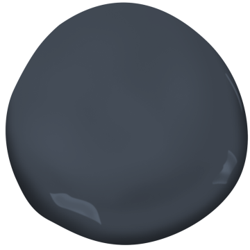
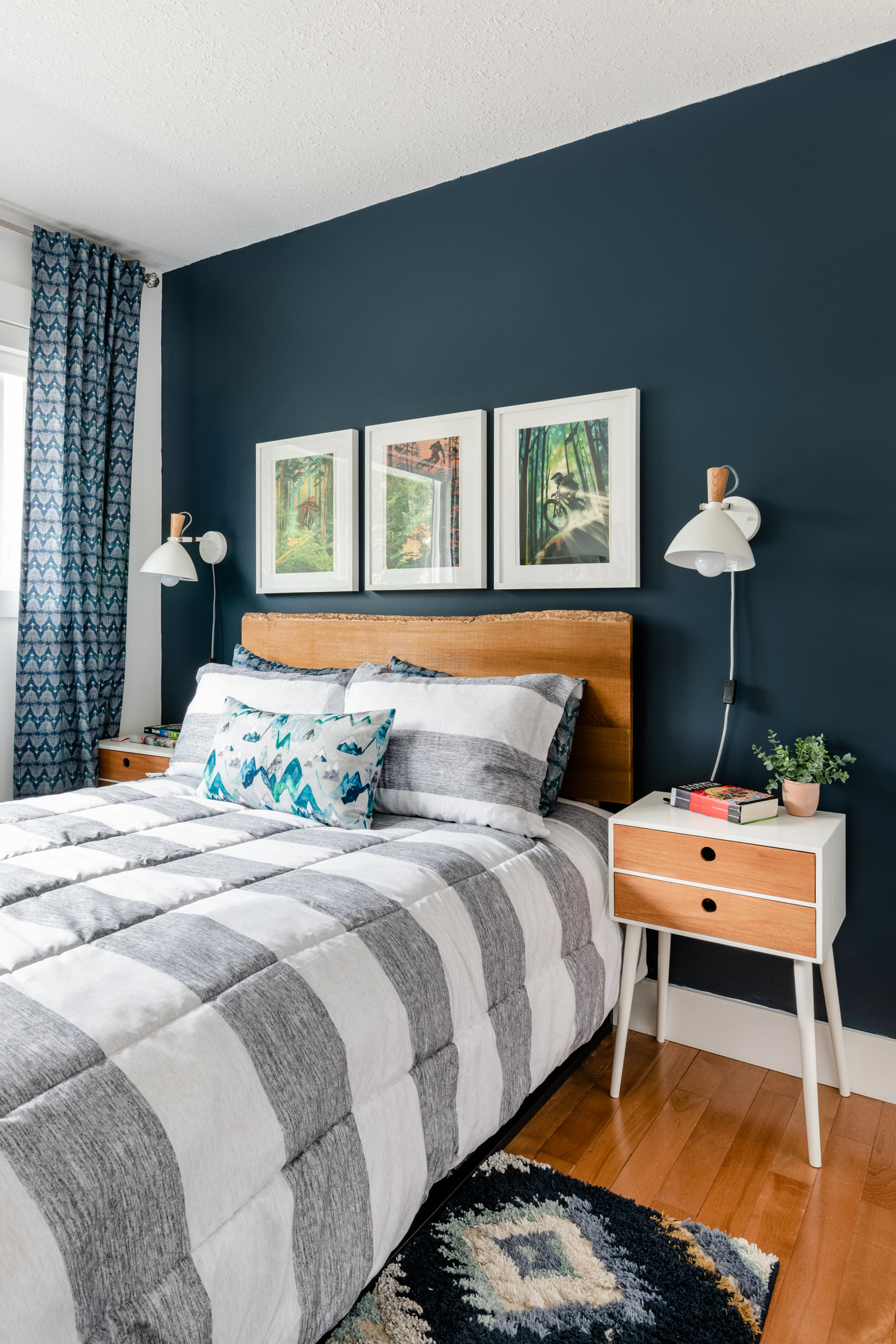
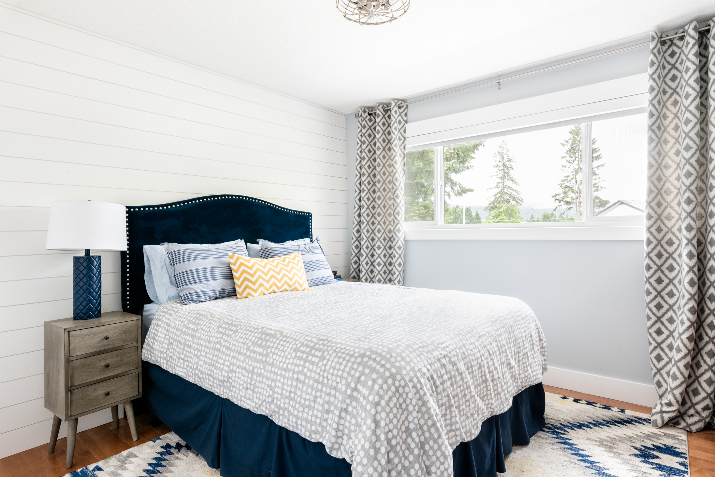
Another favourite reader question is the colour we used on the accent wall in our youngest son’s room. It is Benjamin Moore Hale Navy – a colour I also used in our bathroom in our previous lake house. Hale Navy is one of my all-time favourite Benjamin Moore colours. It is strong and impactful but not jarring. Paired with white walls, as we did here, it feels crisp and fresh. Used throughout a room or on cabinetry I think it would lend a sophistication and elegance to a space.
In our other son’s bedroom as well as the basement bedrooms we used a colour of grey that I had matched to Benjamin Moore Whitestone. It’s a nice clean grey that has a blue undertone in many lights.
Want to remember this? Just PIN it!
Interested in reading more about this house?
It was a major renovation that we tackled in just under 18 months – I shared the entire before and after in this post…

Complete Before & After Home Renovation Tour

I’m in love with the Woodlawn Blue colour match you have here. Do you have the formula for the mix by any chance?
Can you tell me where you bought the round mirror in the white bathroom?
Can you tell me where you got the bed in the bedroom with the navy accent wall? And can you pair a navy accent wall with the other three being tan (Row House Tan)
Can you tell me where you got the headboard in the first bedroom with navy walls? Ans can you pair a navy accent wall with the other 3 tan?
Hi, love these colors. What color are the other walls in the bedroom with the hale navy accent wall? Thanks!
Hi Bridget,
The walls are all very close to BM Chantilly Lace – quite a fresh, pure white. Hope that helps.
Krista
We have multi colour fire place with reds browns etc bricks. Would these colours go as nicely?
Hi Ginger,
I think that some warmer variations on these colours might work better in your case if your fireplace has a lot of brown toned red to it. Try out samples from Benjamin Moore like Revere Pewter, Edgecomb Gray, Pale Oak or similar tones. If you want to use a darker tone try Chelsea Gray or Kendall Charcoal. I always like to get sample testers and try out colours in a space because they change so much based on the light in your room.
Hope that helps,
Krista
Could you also share what Sheen’s you use with each of these??
Hi Diane,
We generally always use a satin or eggshell finish, even on trim. We don’t go up to semi-gloss for trim. Hope that helps!
Krista
Hi! I noticed the photo of your cabinet colour looks much lighter than the grimslov grey/fusion colour you mentioned. I was wondering if it just shows up lighter in your kitchen? Or if there was a different colour? I love it so much!
Thanks!
Hello Tammi,
They are the Grimslov Grey cabinets from Ikea. I used a custom mixed match from Benjamin Moore that they said was very similar to fusion as my touchup paint. The grey was darker looking in the evening light and much lighter in the day when the light came in from outside. Hope that helps!
Krista
Hi,, Can you tell me what sheen of paint you used on your fireplace?