
Summer Home Tour {Summer Living & Dining Room} & a Giveaway!
I am super excited to show off my summer home tour, lots of inspiration!
This is always such an exciting day for me.
Summer Home Tour day.
Partly because by the time I actually get around to posting this tour each year (I can hardly believe this is my third year of summer home tours!!), my report cards are finished and we are definitely on the downhill slope to summer vacation.
In fact, I can hardly believe that I only have six teaching days left in this year… time has been flying by with the start of the big new reno project.
And because of the reno project, it is that much nicer to come home to a clean, organized, bright and cheery summery home. It has definitely become quite the sanctuary for me these days!
So grab your favourite summer beverage, and come on in for the tour…
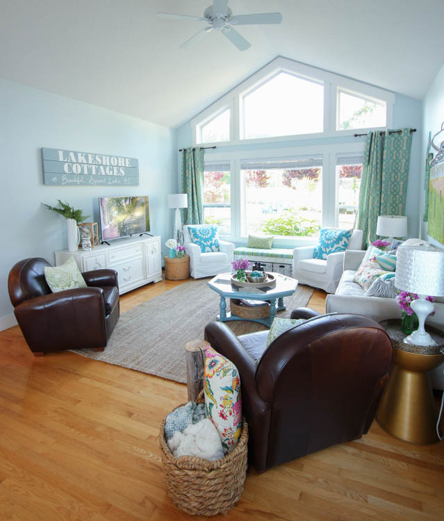
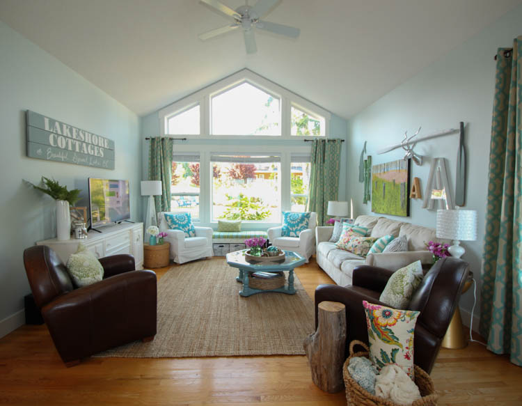
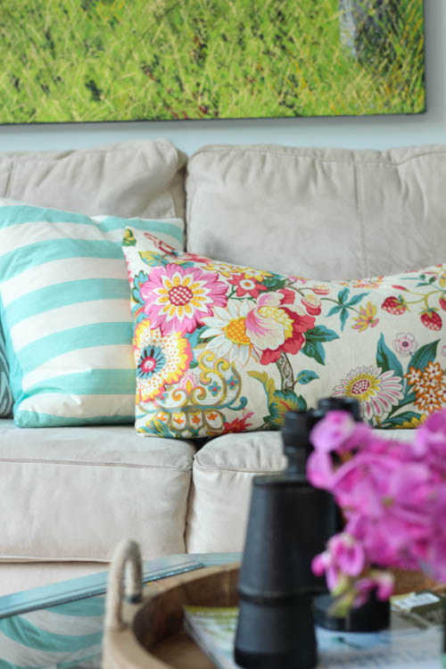
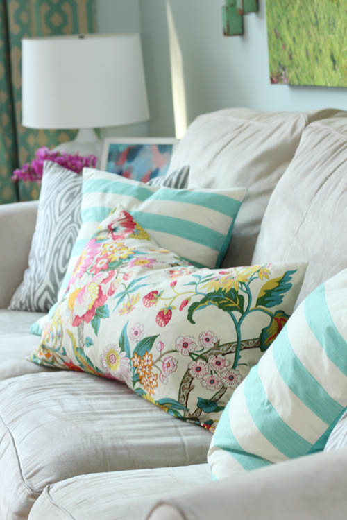
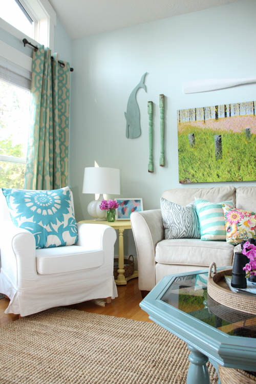
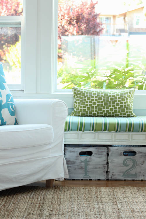
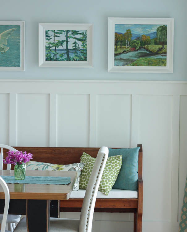
Things haven’t changed too much in the living room since our Spring Home Tour. I did switch around the throw pillows (surprise, surprise), and brought back in a little bit more bright colour with these fresh garden print pillows that I sewed for last summer. The fabric is all from Tonic Living , I bought the floral and faux wood prints last year, and then mixed in my new aqua stripe from this spring’s fabric order. I may have a slight fabric addiction.
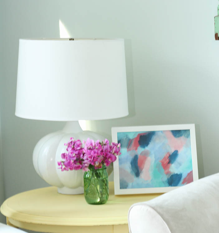
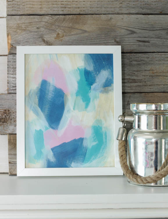
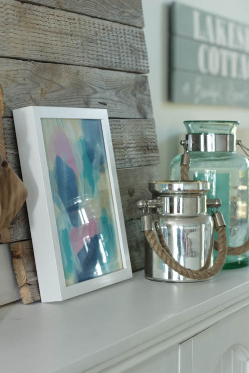
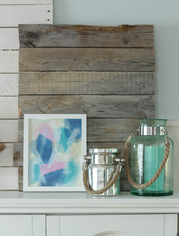
Here is one of the prints that I ordered recently from Z Paint Studio on Etsy – I have 5 now that I have spread throughout the house. And today I’ve got a giveaway going on so you have the opportunity to win one for yourself!
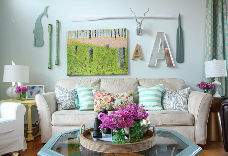
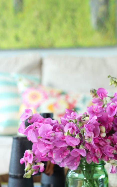
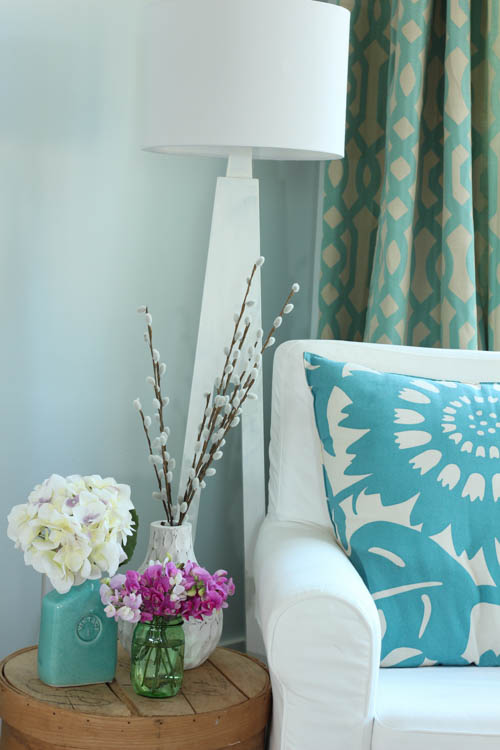
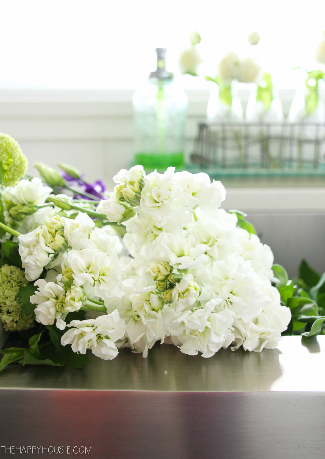
Really, the little wild purple flowers in my green mason jars just make the space. If you do nothing else to add a summery feel in your home, then just pick some wild flowers and throw them in a mason jar. It immediately gives a cheery summer look to your space. Can you believe that these ones grow all over the sides of the road and all down the beaches around here? My 4 year old and I collected all of these in about 20 minutes. For free!
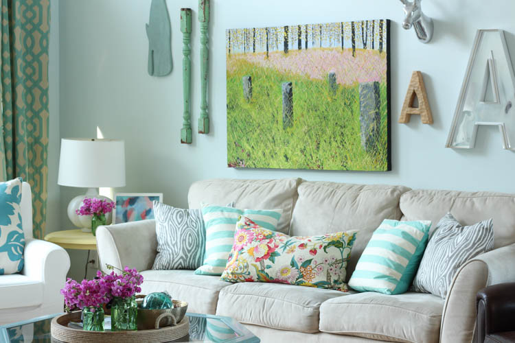
My other Z Paint Studio print graces our summer “mantel” – I just love the way the pastel colours tie together..
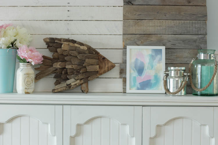
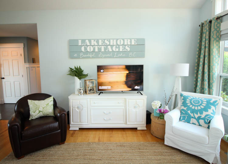
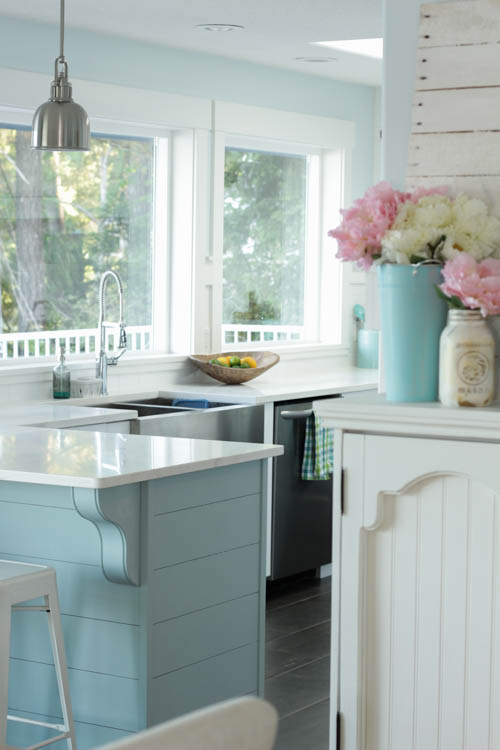
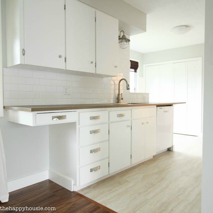
From our mantel you get a little sneak peak into the kitchen… I will be sharing that whole reveal within the next week or two.
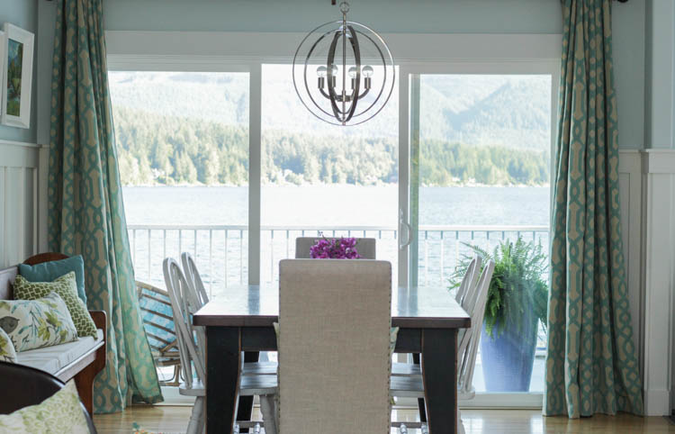
The dining room has had a few changes since my Spring Home tour. I ordered a new light fixture from Wayfair to better coordinate with our kitchen lighting – both the pendants and the sconces that we got through build.com. I also switched out the chairs again to our white Windsor style chairs – I love the softer look of the white chairs rather then the black. I think a new table-build project is on the agenda for the Fall, because I still find the black table a little heavy. I could just paint it, but it was such an expensive set that I would prefer to try to sell it. It isn’t just that it is black- I would really love a longer table (or one with a leaf) that better accommodates large family dinners.
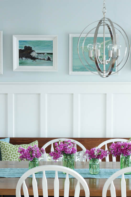
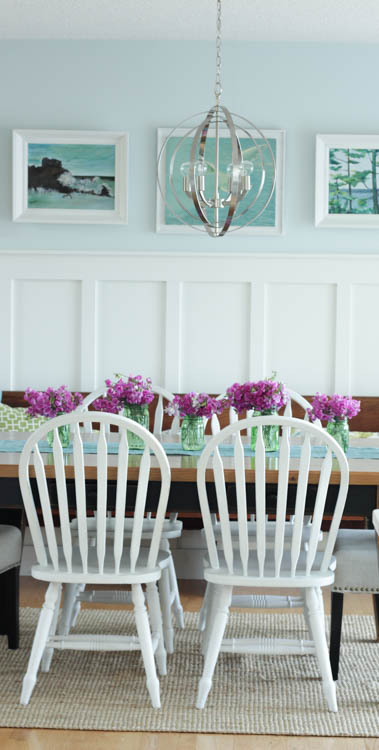
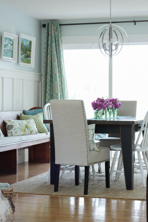
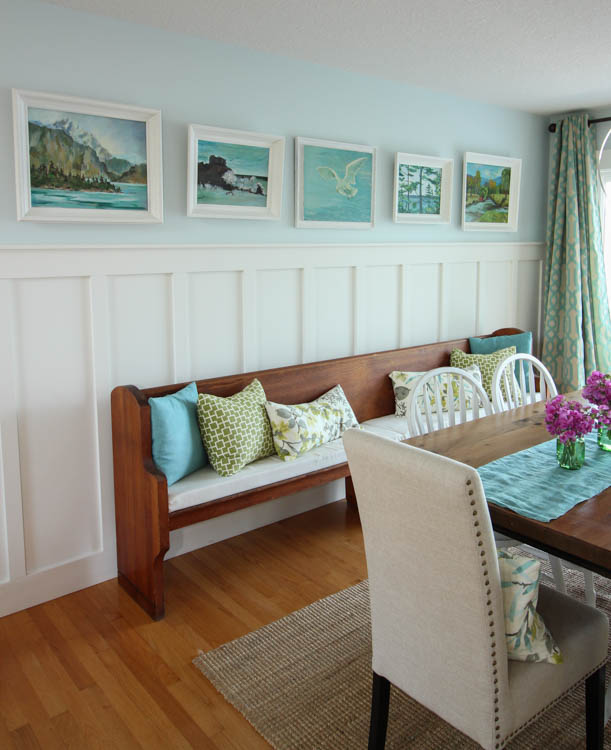
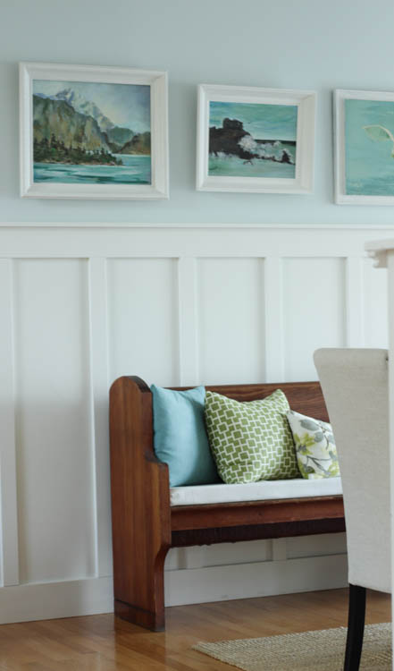
I also switched the paintings around a little bit above the board and batten… my good friend found me a painting with more blues and greens so now the whole grouping seems to flow so much better together. This little gallery is one of my favourite things in the house- which is good because I look at this wall A LOT when I am working at the kitchen peninsula. You may remember me sharing all about these fabulous drapes that I ordered through Kirklands this spring? I am still in love with them…
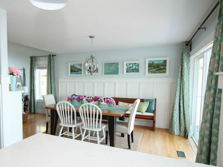
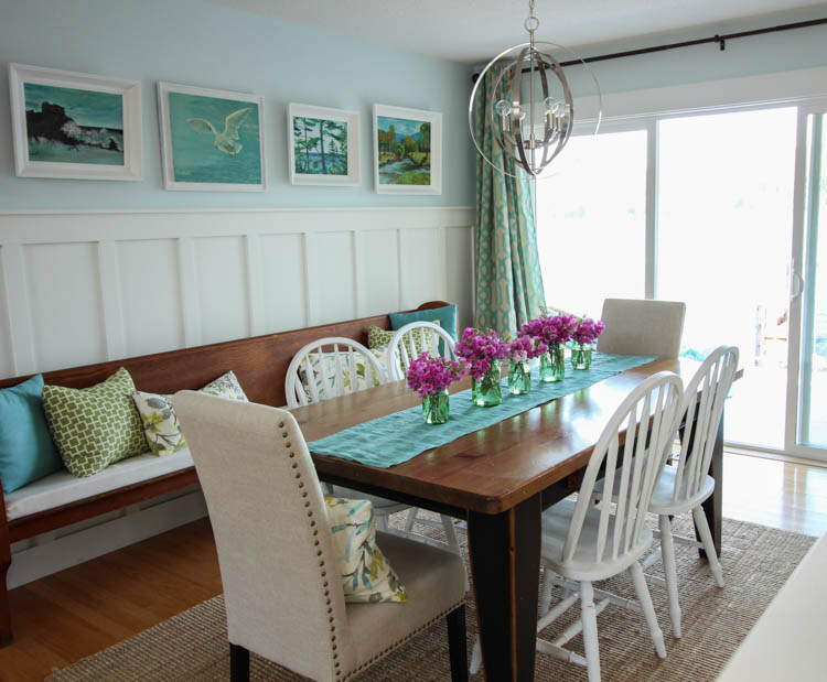
And of course, my favourite feature of our dining room is the view… I love the huge doors. We leave it open most of the time in the good weather, and it is so lovely to have the breeze running through the house. Nothing like a nice light breeze off the lake on a warm, sunny day to make it feel like summer…
Find a little summery inspiration?


Good luck!

And today I am being joined by some of my favourite blogging friends for what promises to be a stunning series of summery home tours. These ladies are all super talented and never fail to impress me with their gorgeous designs. I can’t wait to see what they have in store for us today….
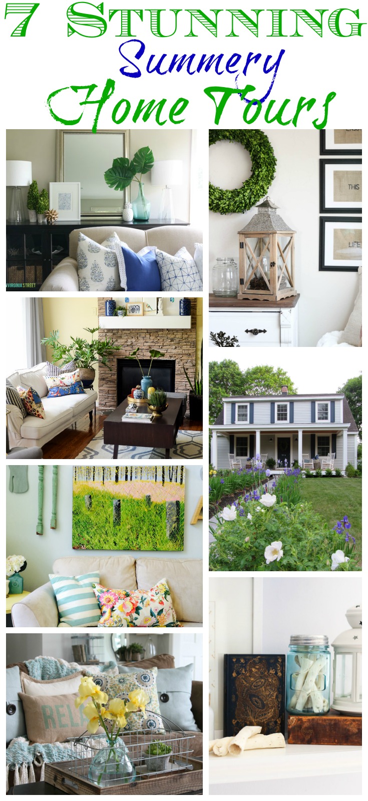
Life on Virginia Street / The Wood Grain Cottage / Place of My Taste / The Migonis Home / The Happy Housie / House by Hoff / Just a Girl and Her Blog

![]()
![]()
![]()
![]()
![]()
![]()
![]()
You had me at coral and navy!!! I would choose the 4 coral navy and teal prints. These would go in my super sad master bathroom that is just dying for some art. My master bedroom just got a makeover in these colors. Perfect!
I would choose the Four (4×4) or (5×5) Teal & Blue Abstract Prints for my livingroom.
What a beautiful house! I love the fresh, bright summer colors…and that view! I love the bench in the dining room. It looks fantastic. So lovely!
Beautiful home! Love the colors. I would choose the real and blue print for my bedroom.
Your home is beautiful and I just love the colours (and of course the lake view!!!) Windsor chairs are a favourite of mine and I like the white ones in your room. I can see why you might want a bigger table in such a generously sized room. I have been painting Windsors in white and Provence to switch out my black ones for a change too. I am tempted to change the black on my table legs as well. The prints are a lovely touch of colour. I would choose the Teal & Blue Abstract Print, totally my favourite colours. Thanks for the chance and also for the tour.
Beautiful home! I LOVE how light and airy everything is. And the view is amazing. 🙂
My vintage beach cottage would love the teals and blues. Our home are these colors with greens too..think sea-glass and vintage Japanese floats of every color. So my pops of colors are jewel tones..sounds crazy but it works.
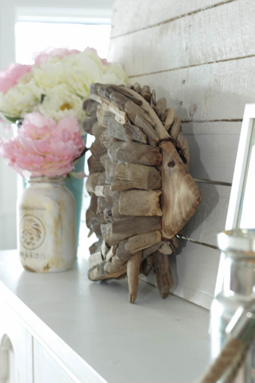
Love your style a whole lot..very similar to mine. The driftwood fish is great..will be making this soon!
Thanks.
Have a great summer!
I hope this is open to non bloggers and USA..I read twice but didn’t see if it was okay to enter. 🙂
Hi Vickie! Sounds like you have a beautiful style!! It is absolutely open to non-bloggers and to US/Canada! Good luck!!
If I were to win this super fun giveaway, I’d choose the Pink & Coral Abstract Print. It would match my bedroom perfectly!!
I love the Pink and Coral Abstract!
Your home is beautiful! Love all the beautiful prints and patterns! I would get the teal and blue abstract print for my home’s family room.
I love the pink and gold prints thank you for the giveaway
Oh my Krista can’t beat that beautiful view (green with envy here in the landlocked prairies). Your house is beautiful and I always swoon over the pretty colors. Love your driftwood fish on the white cabinet – is it locally made?
Your home is beautiful! I love coming to your blog and being inspired. Thanks!
I always love your home tours, Krista! I love soaking in every colorful, inviting detail! I guess no renting it out this Summer, eh? 🙂
Actually we are! Crazy, I know… that’s a whole other story. But we started a new renovation project – you saw all the 70’s amazingness of it – and that is where we plan to stay when we are ‘out’ for a few weeks this summer. I guess I better get my kitchen reveal posted before then!
I would pick the blue, pink and teal print – I would use it near my bedside table in my room. .
Krista – your place is gorgeous! It’s so fun and summery and it feels like a retreat! Did you make that whale on the wall? I need one. I must know if there’s a tutorial for that somewhere!
Thanks Tara! I would love to say I made the whale but I did, in fact, purchase it at Target. I couldn’t believe that it was even the right colour blue. I wish I lived nearer to the border – losing Target in Canada has caused me some serious grief.
Lovely home! I enjoyed the tour very much and I love how bright and relaxing everything is!
Love your tours, as always, Krista! No one adds color more beautifully to their home than you! Can not wait for the kitchen reveal! ( And yay to six more days!!! I seriously cannot wait!!! 🙂
My favorite print was the teal and blue abstract….I love everything blue and love the rich colors in this print!
Love your summer house tour, as well!
Blessings,
Lanita
Your house is always so beautiful! The colors, light, and general feel are very welcoming. I can’t wait to see your new kitchen!
Such a beautiful and bright home! I would choose the Teal & Blue Abstract Print
I am always so excited when you share your home tours! Absolutely stunning, my friend! You and colours are pretty good friends and I love that!;-) Great tour, Krista!
Krista I love how colorful the house looks! Yet it still seems so calm and peaceful! Beautiful!
You always do such a great job bringing in color, Krista! In every tour I’m always jealous of how well you can coordinate fabric and add such great punches of color… that’s not my strongest suit. I can’t WAIT to see the full kitchen!!!
I love the 8×10 Teal & Blue Abstract Print!
Love how bright and cheerful your home is!
Every time I take the tour of your house, I feel like I’ve been transported to a tropical beachy place. All of the colors and coastal decor are perfection!
There is something so dreamy about the pillows choices you have made on your couch! I love the blues and the florals together! How bright and welcoming for summertime!
I love the 4×4 or 5×5 teal and blue prints
I for got to say that I would use them in my bedroom
The teal & blue abstract would be my choice and I would put in mud room.
All your personal touches really shine, the pillows are beautiful….just a gorgeous home….looking forward to seeing more of the kitchen!
your home is the perfect summer place! i love your use of fun color!
You have such a beautiful! I love all the bright and cheerful Summery touches! And that view…….amazing!